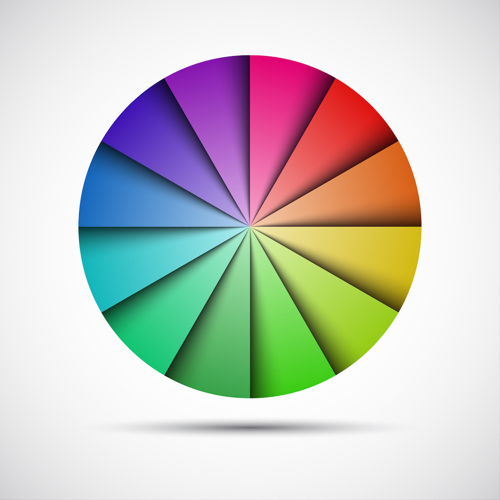
At Hallmark Nameplate, we can handle your project from conception to completion. A hugely detrimental part of the process of completing your project is design, and there’s no doubt that we can handle that too. Recently, we discussed color theory, and how we use that to ensure that your products look as best as they can.
We’ve employed a full-time colorist with full understanding of the color theory, and specializes in color design, matching, and quality control. By doing this, Hallmark Nameplate can ensure that a professional in the design sector is ready and able to detect any dips in quality, using tools that are capable of measuring any variance in the color spectrum.
Now that we’ve discussed both branding and color theory, it’s time to fill you in on something that combines the best of both subjects: colors in relation to psychology and branding. With this knowledge, you’ll be able to understand how and why we design for our clients the way that we do. Color decisions may seem trivial, but the truth is that the hues you choose to incorporate into your designs with Hallmark Nameplate have a huge influence on how your brand is perceived by the common consumer. Here’s what you need to know about the psychology behind your favorite colors:
Primary Colors
Red is overall, a physical color, with its power coming from the fact that it is the longest wavelength. It is no doubt an attention-grabber, which is why it is used in traffic lights and traffic signs. In fact, looking at the color red stimulates and raises the viewer’s pulse, which can lead to the “fight or flight” instinct. While it’s true that is an attention-grabber, too much of it can be perceived as not just demanding, but aggressive.
Blue is considered an intellectual color, or the color of the mind. It’s very soothing to look at and affects us mentally, which is totally different from the way we interpret the color red. There is a differentiation between strong blues and soft blues: strong ones will stimulate clear thought, while lighter blues calm the mind and aid in concentration. Blue in general is often the color of clear communication, so it is relatively popular not just in design, but also as a “favorite color” in the general population. The flipside to this interpretation is that it can be perceived as cold, unemotional, or unfriendly.
Yellow is an emotional color; the wavelength is long and highly stimulating, which is why it is one of the strongest colors, psychologically. Using the right yellow to fit your design will lift spirits and esteem, and it is often thought of as the color of confidence and optimism. There must be a balance, however. The wrong tone in relation to other tones in a color scheme can increase fear and anxiety. Our color experts at Hallmark Nameplate know how to use this color precisely.
Secondary Colors
Orange is a combination of red and yellow, so it is stimulating in the same physical way as red and also emotionally, as with yellow. It allows us to focus our minds on physical comfort, such as food, warmth, and shelter. If used with black, however, it could be taken negatively, as deprivation. If there is too much orange in a design, it could suggest a lack of serious intellectual values.
Green is representative of balance, and strikes the eye in an interesting way. When you look at the color green, your eyes do not have to adjust. This helps the color green be perceived as more restful than other colors. As the center of the color spectrum, it truly allows for balance, which is very important in design! Think about it: the environment around us is home to various green hues, so it’s completely natural for us to feel relieved and reassured by the color.
Violet, or purple, is primarily spiritual in nature, and it has the shortest wavelength out of all colors. Looking at it encourages deep contemplation, or mediation. It even has associations with royalty and communicates high quality, so if you’re looking to portray yourself as a leader in an industry, this is definitely a good option when it comes to design. Additionally, because it is the last visible wavelength before the ultra-violet ray, it is often associated with time, space, and the cosmos.
These are only a few of the options you have available when it comes to designing your new project with Hallmark Nameplate. If you’re looking to work with the leaders in the industry and create a beautiful, functional nameplate, graphic overlay, membrane switch, or other electronic need, contact us today!


