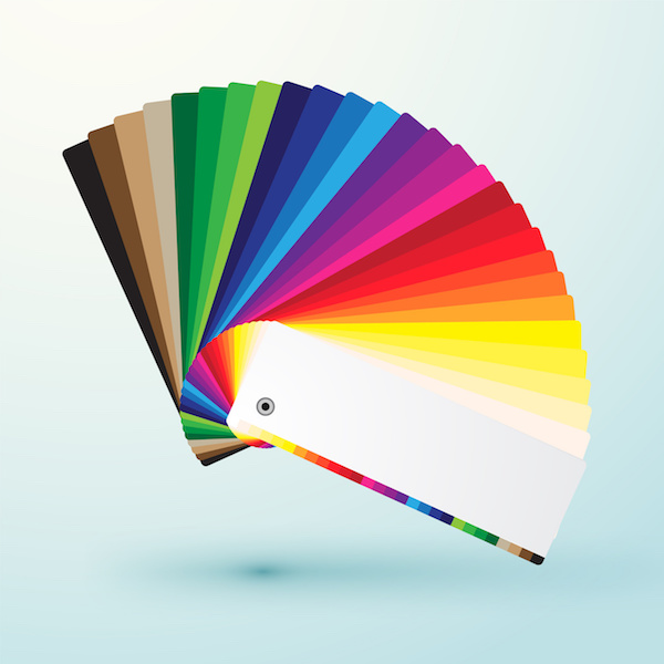
At Hallmark Nameplate, we know how important it is to make sure that the vibrant colors of your designs are accurately printed onto your products. We know that one of the markers of high quality in nameplates, graphic overlays, membrane switches, and screen printing is simpler than most think: color control and color consistency.
By employing a full-time colorist who specializes in color design, color matching, and color quality control, we make sure that an excellent eye for color is detecting any dips in color quality, alongside tools capable of statistically measuring variance in the color spectrum.
But what’s behind our color matching services? Basic color theory is at the core of our mission to provide the highest-quality products. Understanding how color works is an important part of ensuring that your nameplate, graphic overlays, and membrane switches don’t just function properly, but look fantastic as well.
Basic Color Theory
Color theory encompasses a multitude of definitions, concepts and design applications; enough to fill several encyclopedias. However, there are three basic categories of color theory
The Color Wheel
A color circle, based on red, yellow, and blue, is traditional when it comes to the art universe. The first circular diagram of colors was actually developed by Sir Isaac Newton in 1666. Scientists and artists ever since have designed many variations of the original concept. And if you think that the debates over the validity of these different formats are over, think again. Differences of opinion about the validity of one format over another still provoke conversation to this day. The truth of the matter is that any color circle or wheel which presents a logically arranged sequence of pure hues holds merit.
Not only that, but there are also definitions (or categories) of colors based on the color wheel. To get back to basics, we have to start with the primary colors: red, yellow, and blue. In the most traditional of color theories, which is used in paint and pigments, primary colors are the three pigment colors that can not be mixed or formed by any combination of other colors. From these hues, all other colors are derived.
By mixing the primary colors, you can get either purple, orange, or green. These are considered secondary colors. The colors that are then formed by mixing a primary and a secondary color together are called tertiary colors. This is why all of the colors in these hues have a two-word name: yellow-orange, red-orange, red-purple, blue-purple, blue-green, and yellow-green.
Color Harmony
Generally speaking, harmony can be defined as a pleasing arrangement of parts, whether it be music, poetry, color, or even an ice cream sundae.
With a visual experience like color, harmony is something pleasing to the eye that not only engages a viewer, but also creates an inner sense of order, or a balance in the visual experience. At one extreme end of the spectrum is a visual experience that is so bland that the viewer is not engaged, and the human brain will reject the under-stimulating information. At the other end of the spectrum is a visual experience that is so overdone, that the viewer cannot stand to look at it, and the human brain will reject it because it cannot organize it. Color harmony successfully delivers both visual interest and a sense of order.
Ensuring that your designs are perfectly harmonized in color for your nameplate, graphic overlay, or membrane switches means reaching this dynamic color equilibrium.
That being said, there are several formulas suggested in order to reach color harmony. Here are a few examples:
A color scheme based on analogous colors: Analogous colors are any three colors that are side-by-side on the 12-part color wheel, such as yellow-green, yellow, and yellow-orange. Usually of these three colors, one of them predominates.
A color scheme based on complementary colors: Complementary colors are any two which are directly opposite each other, such as red and green, or red-purple and yellow-green. Using these opposing colors creates maximum contrast and maximum stability.
A color scheme based on nature: Nature provides a perfect departure point for color harmony. Regardless of whether a particular combination fits into a technical formula for color harmony, the colors you see working together in nature can create a harmonious design.
Observing the effects colors have on each other is the starting point of understanding the relativity of color. The relationship of values, saturation, and the warmth or coolness of respective hues can cause noticeable differences in our perception of color. With the nuances of color theory on our side, our colorists and graphic designers can create nameplates, graphic overlays, and membrane switches look just as great as they feel.


