


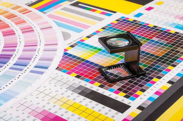
It’s no secret that colors can influence your mood. This is the reason why so many of the brands you love use specific colors to invoke an emotional response from you. By employing color psychology to their branding, they aim to elicit a certain response from the consumer. Whether it be to incite creativity, calmness, or even hunger, these brands use color control to ensure the hues they want to display are accurate and consistent across the board.
So, in this blog, we will discuss the basics of color control, color psychology, and the practical applications of the two.
Without further ado, let’s dive right in!
How Brands Use Color Psychology and Color Control
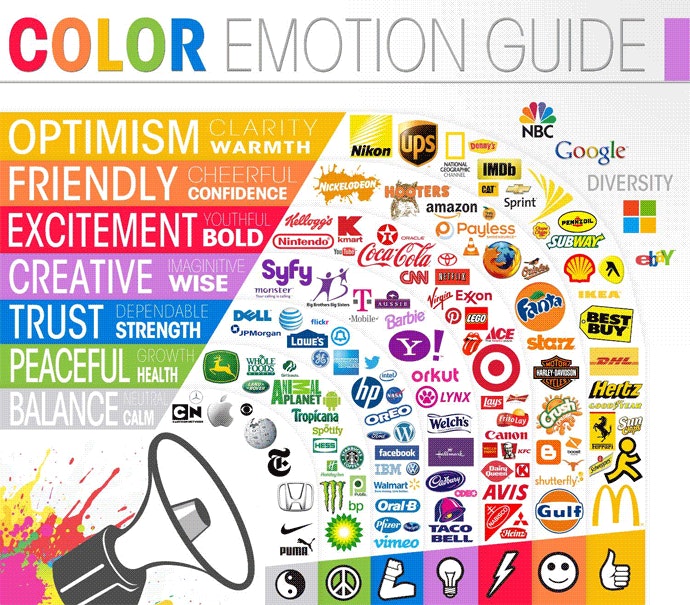
Brands leverage color psychology and color control to create strong, cohesive identities and evoke specific emotional responses from their audiences. By understanding how colors influence perception and behavior, brands can strategically choose colors that align with their values and objectives.
Using Color Psychology
- Brand Identity: Colors are a key component of a brand’s identity. For example, a brand like Coca-Cola uses red to evoke excitement and passion, while Tiffany & Co. uses a specific shade of blue to convey luxury and elegance.
- Marketing and Advertising: Colors are chosen to attract attention and influence purchasing decisions. Fast-food chains often use red and yellow to stimulate appetite and create a sense of urgency.
- Customer Experience: Retailers design store interiors with colors that encourage spending and create a pleasant shopping environment. For instance, calming blues and greens might be used in spas to enhance relaxation.
Using Color Control
- Consistency Across Media: Brands use color control to ensure their colors appear consistent across various media, such as print, digital, and packaging. This consistency reinforces brand recognition and trust.
- Quality Assurance: By employing color profiles and calibration, brands maintain the integrity of their colors across different printing processes and materials. This precision is crucial for packaging, where exact color matching can affect product perception.
- Adaptation to Environments: Brands adjust their colors for different lighting conditions and display environments. For example, a color that looks perfect on a computer screen might need tweaking to look the same on a printed brochure or a billboard under sunlight.

Understanding Color Perception
Color perception is subjective; different people may interpret the same color differently based on personal experiences, cultural backgrounds, and even individual vision. For example, the color white might evoke different mental images for different individuals.
When it comes down to it, what one person means as a particular color can mean something entirely different to someone else. This variability underscores the necessity for precise color control, especially in professional fields where color accuracy is paramount.
The Role of Color Control in Different Fields
Now that we understand the influence of colors, let’s discuss the role of color control. In printing and painting, color control ensures that the colors on the final product match the client’s specifications. This process involves managing the colors across different printers, inks, and media to achieve consistency. Moreover, this is about how onlookers view the colors with their naked eye.
On the other hand, color control for digital media relates to how the hues look on screen AND on print. It involves converting colors accurately among different devices like digital cameras, monitors, scanners, and printers. This ensures that a color appears the same whether viewed on a screen or in print.
Achieving Consistent Color Across Media

Color control is not just about aesthetics; it involves precise mathematical combinations. Colors are typically adjusted using three or four components, depending on the color model (such as RGB for digital displays or CMYK for printing).
Software tools can manipulate these components to achieve the desired color output. To continue, consistency in color representation across various media and devices is achieved through calibration and profiling. Moreover, modern color control tools include calibration devices, colorimeters, and advanced software capable of creating and managing color profiles.
The Color Control Process

Next, to fully understand and implement color control, it’s essential to understand both the tools and the process.
- Calibration: Calibration adjusts the settings of devices to match a standard color space. This step is crucial for ensuring that different devices produce the same color output.
- Profiling: Profiles are pre-defined samples printed and measured to create an idealized description of a color. These profiles describe the color space of the media being used and help in maintaining color consistency.
- Testing: Next, the color samples are measured to ensure they match the intended colors.
- Adjustment: Finally, software tools are utilized to fine-tune colors based on the profiles and calibration data.
Strategic Implementation
Now that you understand the color control process, we can discuss strategies of how to implement this for your business. Using color psychology in accordance with color control, brands can showcase the exact hues they want to achieve their goals.
So, here’s how to implement color control in your business:
- Color Standards: Brands establish color standards using tools like the Pantone Matching System (PMS) to specify exact shades. This ensures all stakeholders, from designers to manufacturers, are on the same page.
- Technology and Tools: Advanced software and hardware, including colorimeters and spectrophotometers, help brands measure and manage color accurately throughout production.
- Training and Guidelines: Brands provide guidelines and training for their teams to understand and apply color psychology and control techniques effectively. This ensures that everyone involved in creating and producing brand materials follows the same color standards.
By integrating color psychology with robust color control practices, brands can create powerful visual identities that resonate with consumers and stand out in the competitive market.
Your Brand, Your Colors
Effective color control is essential for any field that relies on accurate color representation. By understanding and implementing proper calibration, profiling, and the use of advanced technology, consistent and precise colors can be achieved.
As technology continues to evolve, these processes will become even more refined, offering new opportunities for innovation and creativity in color management.
Ready to put the control back in your hands? When you partner with Hallmark Nameplate, we ensure that you get the exact colors you need.
Plus, we employ a full-time colorist who specializes in color design, color matching, and color quality control. She has an eye for excellent color as well as state-of-the-art tools to statistically measure variance in the color spectrum and detect any dips in color quality.
Whether you need high-quality nameplates, labels, or custom printing solutions, Hallmark Nameplate’s advanced technology and meticulous attention to detail guarantee that your brand’s colors will remain consistent and impactful.
Trust Hallmark Nameplate to help you harness the power of color. Request a FREE quote to get started today!
Related Resources from Hallmark Nameplate
- Nameplates vs. graphic overlays
- What is a nameplate?
- Aluminum nameplates
- Metal nameplates
- Custom membrane switches
- Custom graphic overlays
- Why product identification matters
- Polycarbonate vs. polyester overlays
Frequently Asked Questions About Color Control in Manufacturing
What is color control?
Color control is the set of measurement and process practices that make a specified color come out the same every time, across different print runs, different materials and different production methods. In manufacturing it matters because a brand color on a graphic overlay has to match the same color on an adjacent nameplate, a painted bezel and an injection-moulded housing, often produced at different times by different processes.
How is color measured rather than judged by eye?
By instrument. A spectrophotometer reads the light reflected from a sample across the visible spectrum and expresses the result as coordinates in a standard color space, most commonly CIELAB, which maps color onto lightness and two opponent axes. Because the reading is numeric, two samples produced months apart in different facilities can be compared objectively rather than argued about under whatever light happens to be available.
What is Delta E and what tolerance should I specify?
Delta E expresses the numeric distance between two colors in a color space, so it quantifies how far a production sample sits from the target. Smaller is closer. A difference around 1 is generally near the threshold of what a trained observer notices side by side, while larger values become progressively more obvious. Rather than assuming a default, specify the Delta E tolerance and the formula used on the drawing, because tolerance that is tighter than the application needs adds cost and tolerance that is too loose produces visible mismatch between adjacent parts.
Why do colors shift between materials and processes?
Because the substrate participates in the result. The same ink prints differently on gloss polyester than on textured polycarbonate or anodized aluminum, because the surface changes how light scatters. Screen printing lays a thicker ink film than digital printing, producing different opacity and saturation. Substrate color shows through translucent inks. This is why a color approved on one material should never be assumed to transfer to another without a physical sample.
What is metamerism and why does it matter?
Metamerism is when two samples match under one light source and visibly differ under another, because their underlying spectral curves differ even though the eye integrates them to the same result in one lighting condition. It bites when parts are approved under shop lighting and then assembled under different plant or showroom lighting. Specifying the illuminant used for evaluation, and checking under more than one, is what prevents it.
How do you keep brand color consistent across suppliers?
Define the color numerically, not by name or by a printed swatch that will fade. Supply spectral or CIELAB values with the illuminant and observer stated, a Delta E tolerance, and a physical master sample on the actual production substrate. Then require first-article approval against those numbers for each material and process. Sourcing adjacent parts from one manufacturer removes most cross-supplier variation, which is why nameplates, overlays and labels for the same panel are often quoted together.